How to build a simple dashboard
Introduction
We need data to help us make these decisions. Power BI Desktop is a free application for PC that lets you gather, transform, and visualize your data. Power BI Desktop and the Power BI Service work together. You can create your reports in Power BI Desktop and then publish them to the Power BI Service for others to consume.
In this module, you will:
• Learn to connect to data in Power BI desktop
• Transform and model the data you import
• Build basic visualizations
• Create and share a dashboard
• Discover how to collaborate in Power BI
Connect to data
Power BI Desktop connects to many types of data sources, including local databases, worksheets,
and data on cloud services. Sometimes when you gather data, it's not quite as structured, or clean,
as you want it to be. To structure data, you can transform it, meaning that you can split and rename columns, change data types, and create relationships between columns.
You have to follow the following steps to connect data:-
1. Start Power BI Desktop, and choose to Get Data from the ribbon on the Home tab.
2. Choose Excel and press Connect.
3. Find the financial sample workbook which you downloaded and saved locally or to your OneDrive.
Select the file and click Open.
4. A dialogue box with the tables in your data should open. Click the box next to the financials table.
You will see a preview of the data displayed. Select Load.
You can now see that the fields have populated on the farthest right pane. You are currently in the report building tab.
Select the data tab to see a preview of your data.

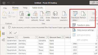
Transform data
1) Click on the Transform Data button on the Home tab of the editing pane.
2)Select the Add Column tab and click Custom Column.

3) A dialogue box will open. Rename your column "Test Column" and double click on Units Sold in the available columns.
4) Type an asterisk (*), and then click the column Manufacturing Price and the Insert button.
5) Click OK.
Visualize data
Now that you have connected and cleaned up your data, it's time to create visuals. Visuals allow you
to present data in a compelling and insightful way and help you to highlight the important components.
Power BI has many compelling visuals and many more are released frequently.
1. Navigate back to the Reports tab and click on the Key Influencers in the Visualizations pane.

2. Click and drag Profit from the Fields pane to Analyze By in the Visualizations pane.
3. Click on the box beside the following columns to add them to your visual: Product, Discounts, Segment, and Units Sold.
4. Select the yellow + at the bottom of your report to create a new page.
5. Select the Line and clustered column chart visual from the Visualizations pane
6. Click on the box beside the following columns in the following order to select them: Product, Manufacturing Price, Sale Price, Profit.
7. Note that Power BI automatically assigns each column to an appropriate field of the visual. In this case, however, we want to click and drag Profit from Column Values to Line Values.
8. Lastly, drag out the corner of your visual so you can better see the information being displayed.


Comments
Post a Comment